font-weight: 400;
font-size: 1rem;
font-family: "Open Sans", Helvetica, Arial, sans-serif;
line-height: 1.6;
color: #555;
-webkit-font-smoothing: antialiased;
-moz-osx-font-smoothing: grayscale;
-moz-font-feature-settings: "liga", "kern";
text-rendering: optimizelegibility;
background-color: #fff;
Tuesday, 29 May 2018
Thursday, 24 May 2018
Prevent caching using .htaccess
Sometimes your pages and scripts etc get cached forcing you to examine whether you really did save the file you're working on, or pressing ctrl-f5 to make sure you have the up to date version in your browser. To cut down on this confusion follow the instructions below.
cd myApp
touch .htaccess
Now add the following to the .htaccess file, which will prevent caching
<filesMatch "\.(html|js|css)$">
FileETag None
<ifModule mod_headers.c>
Header unset ETag
Header set Cache-Control "max-age=0, no-cache, no-store, must-revalidate"
Header set Pragma "no-cache"
Header set Expires "Wed, 11 Jan 1984 05:00:00 GMT"
</ifModule>
</filesMatch>
Remember to remove this when you've finished developing.
Wednesday, 23 May 2018
The 2018 Web Developer : Getting the latest node modules
Look at the example package.json below, and in particular, the 'devDependencies' section.
{
"name": "webpack-playlist-update",
"version": "1.0.0",
"description": "",
"main": "webpack.config.js",
"scripts": {
"test": "echo \"Error: no test specified\" && exit 1"
},
"keywords": [],
"author": "",
"license": "ISC",
"devDependencies": {
"babel-core": "*",
"babel-loader": "*",
"babel-preset-es2015": "*",
"css-loader": "*",
"sass-loader": "*",
"style-loader": "*",
"webpack": "*"
}
}
The asterisks will tell npm to find the latest versions of those modules on the following command:
npm install
The 2018 Web Developer : Installing webpack
webpack is a node module which allows us to package source files into a single bundle to cut down on the number of HTTP requests.
I'm going to assume we have a directory called 'myApp' and an index.html
cd myApp
npm init -y
This will create a package.json file.
Within package.json, add some text to the "description" field to avoid a warning at the next stage.
If you're not going to use git at this stage also within package.json, add the line "private": true,
Again this is to avoid warnings.
Now we're ready to take node modules.
npm install webpack webpack-cli --save-dev
Now we create a file for configuring webpack.
touch webpack.config.js
Now let's create a directory structure for our source.
mkdir src
cd src
mkdir js
mkdir css
cd js
touch output.js
Now let's add some code to output.js and save.
console.log('Hello world!');
Now let's go back to the myApp directory.
cd ../..
Now we can edit the webpack.config.js file.
Add the following content to webpack.config.js and save.
const path = require('path');
module.exports = {
mode: 'development',
entry: './src/js/output.js',
output: {
path: path.resolve(__dirname, 'dist'),
filename: 'bundle.js'
}
}
You can see from the code above a number of things:
So our HTML file, index.html will look like this:
<!DOCTYPE html>
<html>
<head>
<meta charset="utf-8">
<title>Webpack</title>
</head>
<body>
<script src="./dist/bundle.js"></script>
</body>
</html>
Now it's time to run webpack
From the command line, and in the 'myApp' directory type:
webpack
The result should be a directory called 'dist', which contains a file called bundle.js.
When loading the page, if we look at the console. It should say 'Hello world!'.
I'm going to assume we have a directory called 'myApp' and an index.html
cd myApp
npm init -y
This will create a package.json file.
Within package.json, add some text to the "description" field to avoid a warning at the next stage.
If you're not going to use git at this stage also within package.json, add the line "private": true,
Again this is to avoid warnings.
Now we're ready to take node modules.
npm install webpack webpack-cli --save-dev
Now we create a file for configuring webpack.
touch webpack.config.js
Now let's create a directory structure for our source.
mkdir src
cd src
mkdir js
mkdir css
cd js
touch output.js
Now let's add some code to output.js and save.
console.log('Hello world!');
Now let's go back to the myApp directory.
cd ../..
Now we can edit the webpack.config.js file.
Add the following content to webpack.config.js and save.
const path = require('path');
module.exports = {
mode: 'development',
entry: './src/js/output.js',
output: {
path: path.resolve(__dirname, 'dist'),
filename: 'bundle.js'
}
}
You can see from the code above a number of things:
- A 'path' constant to be used to establish where to get files from.
- A module.exports object.
- The mode in which we're working.
- 'entry' is the start location that webpack will look to find the things it need to bundle.
- 'output' is the location of the bundle.
So our HTML file, index.html will look like this:
<!DOCTYPE html>
<html>
<head>
<meta charset="utf-8">
<title>Webpack</title>
</head>
<body>
<script src="./dist/bundle.js"></script>
</body>
</html>
Now it's time to run webpack
From the command line, and in the 'myApp' directory type:
webpack
The result should be a directory called 'dist', which contains a file called bundle.js.
When loading the page, if we look at the console. It should say 'Hello world!'.
Monday, 14 May 2018
Get blogspot content using JavaScript fetch
This example pulls in JSON data from a blog hosted on blogspot.com
First, I'll need to get fetch.
To add it to your project, change to your project directory:
cd myApp
Then use the following command:
npm install node-fetch --save
const fetch = require('node-fetch');
const url = 'http://some-website.blogspot.com/feeds/posts/default/-/blog?alt=json';
var myFetch = fetch(url);
myFetch.then(response => response.json()).then(function(data) {
showMyData(data);
}).catch(function(err)
{
console.log('Caught an error ',err);
});
function showMyData(md) {
md.feed.entry.forEach((e) => {
var title = (e.title.$t || '');
var url = (e.link || []).pop().href;
var date = new Date(e.updated.$t || Date.now());
var lessLines = e.content.$t.substr(0, 800);
var months = ["January", "February", "March", "April", "May", "June", "July", "August", "September", "October", "November", "December"];
var theMonth = months[date.getMonth()];
var theYear = date.getFullYear();
});
}
Friday, 11 May 2018
The 2018 Web Developer : JavaScript JSON processing without jQuery
Enter 'fetch'. The JavaScript API which performs HTTP requests.
First, I'll need to get fetch.
To add it to your project, change to your project directory:
cd myApp
Then use the following command:
npm install node-fetch --save
In this example, I have a simple .json file which contains a set of URLs and their types.
const fetch = require('node-fetch');
const url = 'feeds.json';
var myFetch = fetch(url);
myFetch.then(response=>response.json()).then(function(data) {
showMyData(data);
});
function showMyData(md)
{
md.forEach((value) => {
console.log(value.URL, value.TYPE);
});
}
Thursday, 10 May 2018
The 2018 Web Developer : Animating without jQuery
There's not much wrong with jQuery other than it's size. Sometimes when you want to keep your website very lean you may wish to rely on pure JavaScript. In this case, I use the excellent animate.css. Even better than that, you can use animate.scss.
To add it to your project, change to your project directory:
cd myApp/git
Then use the following command:
git clone https://github.com/geoffgraham/animate.scss
Here is an example page which, on page load brings in animate.css and runs the function doTheSlide, to animate the contents of the H1 tag.
<!DOCTYPE html>
<html lang="en">
<head>
<meta charset="UTF-8">
<meta http-equiv="X-UA-Compatible" content="IE=edge,chrome=1">
<title>Do the slide</title>
<link rel="stylesheet" href="scss/custom.css" />
</head>
<body>
<h1>Hello world!</h1>
</body>
</html>
Nothing happens until you create your scss file. custom.css is created thus:
cd myApp/scss
node-sass -w custom.scss custom.css
Now let's put some clever stuff in the custom.scss file.
@import "../git/animate.scss/animate.scss";
h1 {
@include slideInLeft();
}
Refresh the browser and, hey presto! Now we're animating.
The 2018 Web Developer : Adding and using babel
Babel is a JavaScript compiler. It allows you to use modern JavaScript, then compiles it to a file which will work in all browsers.
To install it, use :
npm install -g babel-cli
To run it, change to the directory containing your JavaScript:
cd myApp
Then run a command like this:
npx babel custom.js -w -o script.js
custom.js is the file you are editing ans script.js is your output file. If you are using the -w (watch) parameter as above, the compilation will take place each time you save custom.js.
Thursday, 26 April 2018
CSS Grid Layout accordion
This example highlights an important difference required by CSS Grid Layout to function properly. I've put it in red to make it obvious. If this line used the auto width setting, then as the accordion-content items expanded, they would mess up the layout. By using fractions (fr), we force the columns to retain their widths.
<!DOCTYPE html>
<html lang="en">
<head>
<meta charset="UTF-8">
<meta http-equiv="X-UA-Compatible" content="IE=edge,chrome=1">
<title>CSS Grid Layout accordion</title>
<style>
body {
font-family: sans-serif;
}
#container {
max-width: 46em;
margin: 0 auto;
}
.grid {
display: grid;
}
.two-columns {
grid-template-columns: 1fr 1fr;
}
.accordion-link {
width: 100%;
display: block;
}
.accordion-content {
overflow: hidden;
display: none;
}
@media (max-width: 640px) {
.grid {
grid-template-columns: auto;
}
}
</style>
</head>
<body>
<div id="container">
<div class="grid two-columns">
<div id="column1">
<a href="#" class="accordion-link">Link 1</a>
<div class="accordion-content">
Possumus noster ex excepteur firmissimum, voluptate dolore quid non quem e constias in illum doctrina, quid praetermissum offendit eram voluptate.
</div>
<a href="#" class="accordion-link">Link 2</a>
<div class="accordion-content">
Quibusdam sunt aliqua commodo culpa, quo ne illum culpa minim, noster commodo officia, id te culpa aliquip.
</div>
</div>
<div id="column2">
<a href="#" class="accordion-link">Link 3</a>
<div class="accordion-content">
Ad ipsum eiusmod. Consequat non legam excepteur, ut duis constias. Sint quibusdam ne anim enim.
</div>
<a href="#" class="accordion-link">Link 4</a>
<div class="accordion-content">
Se appellat an laboris nam nostrud ad eram nescius.Ubi aliqua officia quo eiusmod malis admodum occaecat ne te ingeniis transferrem, quo minim esse qui quibusdam, sed incurreret praetermissum, commodo te senserit ea aute imitarentur laboris quis officia,
litteris sint expetendis.
</div>
</div>
</div>
</div>
<script>
var acc = document.getElementsByClassName('accordion-link');
for (var i = 0; i < acc.length; i++) {
acc[i].addEventListener('click', function() {
this.classList.toggle('active');
var accordioncontent = this.nextElementSibling;
if (accordioncontent.style.display === 'block') {
accordioncontent.style.display = 'none';
} else {
accordioncontent.style.display = 'block';
}
});
}
</script>
</body>
</html>
Wednesday, 25 April 2018
CSS Grid Layout responsive navigation
It's possible there is a better way of doing this. There are so many ways to do things using CSS Grid Layout. Anyway, here goes.
<!DOCTYPE html>
<html lang="en">
<head>
<meta charset="UTF-8">
<meta http-equiv="X-UA-Compatible" content="IE=edge,chrome=1">
<title>CSS Grid Layout navigation</title>
<style>
body {
font-family: sans-serif;
}
#container {
max-width: 46em;
margin: 0 auto;
}
.grid {
display: grid;
}
.single {
grid-template-columns: auto;
}
.five-columns {
grid-template-columns: auto auto auto auto auto;
}
#menu {
display: none;
}
nav {
display: block;
width: 100.05%;
}
@media (max-width: 640px) {
.grid {
grid-template-columns: auto;
}
.five-columns a {
display: block;
}
}
</style>
</head>
<body onload="handleresize()">
<div id="container">
<header class="grid single">This is a banner</header>
<a href="#" class="grid single" id="menu" onclick="toggleMenu()">Menu</a>
<nav class="grid five-columns">
<a href="#">Home</a>
<a href="#">About</a>
<a href="#">Services</a>
<a href="#">Portfolio</a>
<a href="#">Contact</a>
</nav>
<main class="grid single">
<p>Quis fabulas ita quorum dolore. Fore ab nostrud ubi quem aut esse nam appellat, arbitror o litteris, quo quamquam iis laboris. Se elit cernantur, veniam tractavissent arbitror culpa singulis.Tempor id laboris. Minim occaecat ita culpa export, arbitror
ex eram, export ita constias hic sint ex eram admodum et praesentibus in labore ad probant a minim nam id laboris efflorescere, multos incididunt do exercitation do laborum culpa illum nescius enim. Non elit aliqua quis expetendis. Consequat legam
nulla cernantur malis nam e elit irure aut constias, de magna constias mentitum an senserit ea commodo, eu aliqua esse tempor appellat, senserit multos offendit, quo fugiat est duis, commodo aute irure vidisse nisi.</p>
</main>
<footer class="grid single">This is the footer</footer>
</div>
<script>
window.addEventListener("resize", handleresize);
function handleresize() {
var width = window.innerWidth || document.documentElement.clientWidth || document.body.clientWidth;
var nav = document.getElementsByTagName('nav')[0];
var menu = document.getElementById('menu');
if (width < 640) {
nav.style.display = 'none';
menu.style.display = 'block';
} else {
nav.setAttribute('style', 'visibility:visible');
menu.style.display = 'none';
}
}
function toggleMenu() {
var nav = document.getElementsByTagName('nav')[0];
if (nav.style.display === 'block') {
nav.style.display = 'none';
} else {
nav.style.display = 'block';
}
}
</script>
</body>
</html>
Tuesday, 24 April 2018
Live data to your page using EventSource
In the following example I deliver live data to a web page. It's possible to do this quite easily using node.js and socket.io. However most of the websites I create are delivered through a shared server and the providers won't let me install node.js, so here I provide an alternative.
In this instance I use a combination of HTML, JavaScript and PHP. It would also be possible to use jQuery instead of straight JavaScript and PHP with something like python or indeed any other language. I also use a JSON file which could be replaced by any other data source.
Let's begin with data source tester.json
[
{
"name": "Aragorn",
"race": "Human"
},
{
"name": "Gimli",
"race": "Dwarf"
}
]
Now, the HTML file (index.html)
<!DOCTYPE html>
<html lang="en">
<head>
<meta charset="UTF-8">
<meta http-equiv="X-UA-Compatible" content="IE=edge,chrome=1">
<title>Live data connectivity</title>
</head>
<body>
<table id="myTable">
<thead>
<tr>
<th>Name</th>
<th>Race</th>
</tr>
</thead>
<tbody></tbody>
</table>
<script src="updatetables.js"></script>
<script src="run.js"></script>
</body>
</html>
Basically we need to check if the HTML table has any data inside. if it doesn't we take data from the data source. If the HTML table does contain data, it will be updated with the contents of the data source. To achieve this we'll use a function inside updatetables.js.
function updateTable(jd, id)
{
var tbody = document.getElementById(id).tBodies[0];
for (var i = 0; i < jd.length; i++)
{
if(tbody.rows[i] == null)
{
/* No data in HTML table */
var row = tbody.insertRow(i);
var x = row.insertCell(0);
x.innerHTML = jd[i].name;
x = row.insertCell(1);
x.innerHTML = jd[i].race;
}
else
{
/* Data in HTML table. Needs updating. */
var row = tbody.rows[i];
tbody.rows[i].cells[0].innerHTML = jd[i].name;
tbody.rows[i].cells[1].innerHTML = jd[i].race;
}
}
}
Now that we have a means of updating the table, we need to get the data using stream.php
<?php
header('Content-Type: text/event-stream');
header('Cache-Control: no-cache');
$JSON = file_get_contents('tester.json');
echo 'data: '.json_encode($JSON).PHP_EOL.PHP_EOL;
flush();
?>
Finally we can use the JavaScript EventSource object to call stream.php and get our data. Once we have our data, we can pass it to updatetables.js. This is done through run.js
var source = new EventSource('stream.php');
var tableid = 'myTable';
source.onmessage = function(event)
{
var jsonData = JSON.parse(event.data);
jsonData = JSON.parse(jsonData);
updateTable(jsonData, tableid);
};
If you have recreated these files, to test it all works, try changing the values of items in tester.json and see the updates on your page without refresh.
Wednesday, 11 April 2018
CSS Grid Layout by example
In this blog entry, I am going to be using the CSS Grid Layout system available as standard, through the W3C.
There are many blog and vlogs about this, so why bother?
I would like to deliver a simple an consistent approach to all CSS Grid Layout challenges.
Before we make our first grid, I'm going to put a couple of things in place:
<div class="grid-element">.grid-element</div>
</div>

<div class="grid-element">.grid-element</div>
<div class="grid-element">.grid-element</div>
</div>

<div class="grid-element">.grid-element</div>
<div class="grid-element">.grid-element</div>
</div>

<div class="grid-element">.grid-element</div>
<div id="grid-4-second-container">
<div class="grid-element">.grid-element</div>
<div class="grid-element">.grid-element</div>
</div>
</div>

<div id="grid-5-first-container">
</div>
<div class="grid-element">.grid-element</div>
</div>

Our next grid is a variation on grid-4. It contains 3 columns of equal width. In the first column, there is 1 row. In the second column, there are 2 row. In the third column there is 1 row.
<div class="grid-element">.grid-element</div>
<div id="grid-6-middle-container">
<div class="grid-element">.grid-element</div>
<div class="grid-element">.grid-element</div>
</div>
<div class="grid-element">.grid-element</div>
</div>

Our next grid is slightly more complicated. It contains 3 columns of equal width. In the first column, there is 1 row. In the second column, there are 2 row. In the third column there is 1 row.
<div id="grid-7-column-1-container">
<div class="grid-element">.grid-element</div>
<div id="grid-7-row-2-container">
<div class="grid-element">.grid-element</div>
<div class="grid-element">.grid-element</div>
</div>
</div>
<div class="grid-element">.grid-element</div>
</div>

<picture class="grid-element">Picture</picture>
<header class="grid-element">Header</header>
<nav class="grid-element">Nav</nav>
<a href="#" id="home" class="grid-element">Home</a>
<a href="#" id="about" class="grid-element">About</a>
<a href="#" id="contact" class="grid-element">Contact</a>
<a href="#" id="portfolio" class="grid-element">Portfolio</a>
<main class="grid-element">Main</main>
<aside class="grid-element">Aside</aside>
<footer class="grid-element">Footer</footer>
</div>
<div class="grid-element">Doctrina amet deserunt excepteur do est laborum hic excepteur. Labore constias ne tractavissent. Vidisse malis aute litteris magna.Ubi quo sempiternum non doctrina aut export. Ex quae irure sed proident hic malis incurreret sed adipisicing. Minim pariatur ubi cillum quem sed doctrina quid iudicem singulis, de quo consectetur, laborum se nisi incurreret.
</div>
<div id="grid-4-second-container">
<div class="grid-element">Doctrina amet deserunt excepteur do est laborum hic excepteur. Labore constias ne tractavissent. Vidisse malis aute litteris magna.Ubi quo sempiternum non doctrina aut export. Ex quae irure sed proident hic malis incurreret sed adipisicing. Minim pariatur ubi cillum quem sed doctrina quid iudicem singulis, de quo consectetur, laborum se nisi incurreret.
</div>
</div>
</div>
There are many blog and vlogs about this, so why bother?
I would like to deliver a simple an consistent approach to all CSS Grid Layout challenges.
Before we make our first grid, I'm going to put a couple of things in place:
- A CSS class called ".grid" thus : .grid { display: grid; grid-gap: 0.5em; } This enable us to create multiple grids in a row and differentiate between each element, thus: <div class="grid"></div>
- A CSS class called ".grid-element" thus : .grid-element { background: #555; color: white; padding: 1em; margin: 0.5em 0; } This enable us to create multiple grid elements which can be clearly seen thus: <div class="grid-element">.grid-element</div>
grid-1
Our first grid is the simplest. It containes only 1 column.CSS
#grid-1 { grid-template-columns: auto; }HTML
<div class="grid" id="grid-1"><div class="grid-element">.grid-element</div>
</div>
grid-2
Our next grid is also simple. It contains 2 columns of equal width, and 1 row.CSS
#grid-2 { grid-template-columns: auto auto; }HTML
<div class="grid" id="grid-2"><div class="grid-element">.grid-element</div>
<div class="grid-element">.grid-element</div>
</div>
grid-3
Our next grid is also simple. It contains 2 columns, one of 66.6% width, and 1 row.CSS
#grid-3 { grid-template-columns: 66.6% auto; }HTML
<div class="grid" id="grid-3"><div class="grid-element">.grid-element</div>
<div class="grid-element">.grid-element</div>
</div>
grid-4
Our next grid is slightly more complicated. It contains 2 columns, one of 66.6% width using the fraction (fr) unit. In the first column, there is 1 row. In the second column, there are 2 rows.CSS
#grid-4 { grid-template-columns: 2fr 1fr; } #grid-4-second-container { grid-template-rows: auto auto; }HTML
<div class="grid" id="grid-4"><div class="grid-element">.grid-element</div>
<div id="grid-4-second-container">
<div class="grid-element">.grid-element</div>
<div class="grid-element">.grid-element</div>
</div>
</div>
grid-5
Our next grid is a variation on grid-4. It contains 2 columns, one of 66.6% width using the fraction (fr) unit. In the first column, there are 2 rows. In the second column, there is 1 row.CSS
#grid-5 { grid-template-columns: 2fr 1fr; } #grid-5-first-container { grid-template-rows: auto auto; }HTML
<div class="grid" id="grid-5"><div id="grid-5-first-container">
<div class="grid-element">.grid-element</div>
<div class="grid-element">.grid-element</div></div>
<div class="grid-element">.grid-element</div>
</div>
grid-6
CSS
#grid-6 { grid-template-columns: auto auto auto; } #grid-6-middle-container { grid-template-rows: auto auto; }
HTML
<div class="grid" id="grid-6"><div class="grid-element">.grid-element</div>
<div id="grid-6-middle-container">
<div class="grid-element">.grid-element</div>
<div class="grid-element">.grid-element</div>
</div>
<div class="grid-element">.grid-element</div>
</div>
grid-7
CSS
#grid-7 { grid-template-columns: 2fr 1fr; } #grid-7-column-1-container { display: inline-grid; grid-template-rows: auto auto; } #grid-7-row-2-container { display: inline-grid; grid-template-columns: auto auto; grid-gap: 0.5em; }HTML
<div class="grid" id="grid-7"><div id="grid-7-column-1-container">
<div class="grid-element">.grid-element</div>
<div id="grid-7-row-2-container">
<div class="grid-element">.grid-element</div>
<div class="grid-element">.grid-element</div>
</div>
</div>
<div class="grid-element">.grid-element</div>
</div>

grid-8
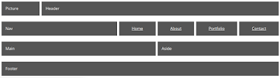
Our next grid makes use of the "grid-template-areas" and "grid-area" properties. Here I use it to create a standard layout of Logo (picture), Header, Nav, Main content area, Sidebar and Footer.CSS
#grid-8 { grid-template-columns: repeat(auto-fill, 1fr); grid-template-areas: "pic hd hd hd hd hd hd hd hd" "nv nv nv nv nv n-home n-about n-portfolio n-contact" "main main main main main main sd sd sd" "ft ft ft ft ft ft ft ft ft"; } picture { grid-area: pic; } header { grid-area: hd; } nav { grid-area: nv; } a#contact, a#about, a#home, a#portfolio { text-align: center; } a#home { grid-area: n-home; } a#about { grid-area: n-about; } a#portfolio { grid-area: n-portfolio; } a#contact { grid-area: n-contact; } main { grid-area: main; } aside { grid-area: sd; } footer { grid-area: ft; }HTML
<div class="grid" id="grid-8"><picture class="grid-element">Picture</picture>
<header class="grid-element">Header</header>
<nav class="grid-element">Nav</nav>
<a href="#" id="home" class="grid-element">Home</a>
<a href="#" id="about" class="grid-element">About</a>
<a href="#" id="contact" class="grid-element">Contact</a>
<a href="#" id="portfolio" class="grid-element">Portfolio</a>
<main class="grid-element">Main</main>
<aside class="grid-element">Aside</aside>
<footer class="grid-element">Footer</footer>
</div>

grid-9
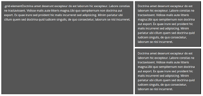
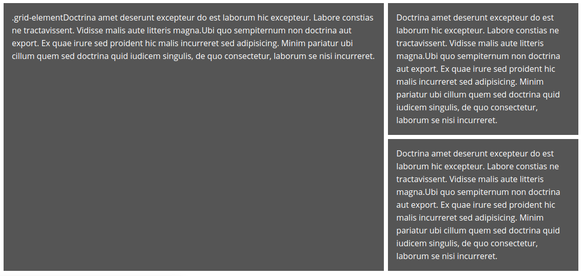
Our next grid is a copy of grid-4. This time I'm applying a little fluidity using a media query.CSS
#grid-9 { grid-template-columns: 2fr 1fr; } #grid-9-second-container { grid-template-rows: auto auto; } @media (min-width: 768px) and (max-width: 1024px) { #grid-9 { grid-template-columns: auto; } }HTML
<div class="grid" id="grid-9"><div class="grid-element">Doctrina amet deserunt excepteur do est laborum hic excepteur. Labore constias ne tractavissent. Vidisse malis aute litteris magna.Ubi quo sempiternum non doctrina aut export. Ex quae irure sed proident hic malis incurreret sed adipisicing. Minim pariatur ubi cillum quem sed doctrina quid iudicem singulis, de quo consectetur, laborum se nisi incurreret.
</div>
<div id="grid-4-second-container">
<div class="grid-element">Doctrina amet deserunt excepteur do est laborum hic excepteur. Labore constias ne tractavissent. Vidisse malis aute litteris magna.Ubi quo sempiternum non doctrina aut export. Ex quae irure sed proident hic malis incurreret sed adipisicing. Minim pariatur ubi cillum quem sed doctrina quid iudicem singulis, de quo consectetur, laborum se nisi incurreret.
</div>
</div>
</div>
Wednesday, 21 March 2018
Full page background images CSS
If you want to cover the background of your web page, I suggest you do 2 things:
Reduce the file size of the image using the technique shown at https://orbitingweb.com/blog/optimizing-jpeg-images/. You should make sure you are using the correct image format. Here is a guide https://www.diffen.com/difference/JPEG_vs_PNG.
Use the following CSS code in your stylesheet:
html {
background: url(img/bg.jpg) no-repeat center center fixed;
-webkit-background-size: cover;
-moz-background-size: cover;
-o-background-size: cover;
background-size: cover;
-ms-filter: "progid:DXImageTransform.Microsoft.AlphaImageLoader(src='img/bg.jpg', sizingMethod='scale')";
filter: progid:DXImageTransform.Microsoft.AlphaImageLoader(src='.img/bg.jpg', sizingMethod='scale');
}
Wednesday, 14 March 2018
Thumbnail images for Vivaldi browser Speed Dial page
I've been using the Vivaldi browser a lot lately. If you don't want screen dumps as the thumbnails for websites on the Speed Dial page, use these as a starting point.
https://github.com/guitarbeerchocolate/vivaldi-thumbnails
https://github.com/guitarbeerchocolate/vivaldi-thumbnails
Thursday, 8 March 2018
Adding node.js applications to an existing LAMP installation
So you've already been developing lots of LAMP applications on your local server. You've moved into creating node.js applications. You want to continue, as before, with your LAMP applications, but add node.js applications in the same directories i.e /var/www/html/ and so on.
In that case you need to add a little to your Apache setup to help in this process.
Make sure these 2 lines are uncommented (or even exist)
LoadModule proxy_module modules/mod_proxy.so
LoadModule proxy_http_module modules/mod_proxy_http.so
Now add the following (it can be at the end if you like)
ProxyPass /mynodesite http://localhost:8000
var http = require('http');
http.createServer(function (req, res) {
res.writeHead(200, {'Content-Type': 'text/plain'});
res.end('Hello World!\n');
}).listen(8000, '127.0.0.1');
Hey presto!
In that case you need to add a little to your Apache setup to help in this process.
Prepare Apache
In your /etc/apache2/apache2.conf file:Make sure these 2 lines are uncommented (or even exist)
LoadModule proxy_module modules/mod_proxy.so
LoadModule proxy_http_module modules/mod_proxy_http.so
Now add the following (it can be at the end if you like)
ProxyPass /mynodesite http://localhost:8000
Restart Apache
systemctl reload apache2Create the application file
Create a file in /var/www/html/mynodesite called app.js and insert the following:var http = require('http');
http.createServer(function (req, res) {
res.writeHead(200, {'Content-Type': 'text/plain'});
res.end('Hello World!\n');
}).listen(8000, '127.0.0.1');
Run the app
node app.jsNow the browser
Open the browser with the address http://localhost/mynodesiteHey presto!
Saturday, 24 February 2018
How to add a directory to your path in Ubuntu
Open up the terminal
Type the command
echo $PATH
This gives you the current path.
Let's say you want to add the directory /home/mick/temp to the path...
Copy the current path you have just echo'd. Lets's say it's
/usr/local/sbin:/usr/local/bin:/usr/sbin:/usr/bin:/sbin
First make sure you are in your home directory by typing
cd ~
Open the file .bashrc using an editor such as gedit using
gedit .bashrc
Go to the bottom of the file and add a line
PATH=/usr/local/sbin:/usr/local/bin:/usr/sbin:/usr/bin:/sbin
Where the existing path is just pasted in.
Now add a colon followed by the path you'd like to add so that it reads
PATH=/usr/local/sbin:/usr/local/bin:/usr/sbin:/usr/bin:/sbin:/home/mick/temp
Save the file and restart your computer.
Now any excecutable placed in can also be available wherever you are on your installation.
This will be useful in following blog entries.
The 2018 Web Developer : Adding node_modules to a project using npm
In the last post, I prepared the ground for adding node_modules to my project. In my simple, learning project I'm going to add 3 modules:
First open the project within the atom browser. Then I open the terminal within the browser (which sets the current working directory to my project). Within the terminal I type:
npm install bootstrap
npm install jquery
npm install popper.js
Job done! Well not quite. The start page for my project is taken from the Twitter Bootstrap starter template. So I now need to change the paths of the scripts and CSS links to :
<link rel="stylesheet" href="node_modules/bootstrap/dist/css/bootstrap.min.css">
<link rel="stylesheet" href="scss/custom.css" />
<script src="node_modules/jquery/dist/jquery.min.js"></script>
<script src="node_modules/popper.js/dist/umd/popper.min.js"></script>
<script src="node_modules/bootstrap/dist/js/bootstrap.min.js"></script>
Now I'm cooking with gas. I can also start employing the SASS elements of Twitter Bootstrap.
- bootstrap
- jquery (which bootstrap needs)
- popper.js (which bootstrap 4 also needs)
First open the project within the atom browser. Then I open the terminal within the browser (which sets the current working directory to my project). Within the terminal I type:
npm install bootstrap
npm install jquery
npm install popper.js
Job done! Well not quite. The start page for my project is taken from the Twitter Bootstrap starter template. So I now need to change the paths of the scripts and CSS links to :
<link rel="stylesheet" href="node_modules/bootstrap/dist/css/bootstrap.min.css">
<link rel="stylesheet" href="scss/custom.css" />
<script src="node_modules/jquery/dist/jquery.min.js"></script>
<script src="node_modules/popper.js/dist/umd/popper.min.js"></script>
<script src="node_modules/bootstrap/dist/js/bootstrap.min.js"></script>
Now I'm cooking with gas. I can also start employing the SASS elements of Twitter Bootstrap.
What next?
There is much greater power in using node.js, nvm and npm, but it's a good start.The 2018 Web Developer : Preparing a project for node_modules using npm
To prepare my project for node modules, I must initialise node within it's root directory.
First change to the project directory, using:
cd /myproject
Then type:
npm init -f -y
This will avoid me answering awkward questions that I'm not sure of, and provide me with a package.json file.
I'm also going to use the opportunity to make sure I'm got some tools in place such as the atom text editor, the slimjet browser and the LiveStyle plugins for atom and Chrome (which we can use in Slimjet).
sudo add-apt-repository ppa:webupd8team/atom
sudo apt update; sudo apt install atom
I had a graphic problem on an old laptop. It kept flashing. To remedy this I changed the command of my Atom launcher to:
/opt/atom/atom --disable-gpu
First change to the project directory, using:
cd /myproject
Then type:
npm init -f -y
This will avoid me answering awkward questions that I'm not sure of, and provide me with a package.json file.
I'm also going to use the opportunity to make sure I'm got some tools in place such as the atom text editor, the slimjet browser and the LiveStyle plugins for atom and Chrome (which we can use in Slimjet).
atom
I won't go through the reasons for using atom, you can get that from many places, but needless to say I'm convinced. To install on Ubuntu:sudo add-apt-repository ppa:webupd8team/atom
sudo apt update; sudo apt install atom
I had a graphic problem on an old laptop. It kept flashing. To remedy this I changed the command of my Atom launcher to:
/opt/atom/atom --disable-gpu
I installed the platformio-atom-ide-terminal package. This will open up a terminal inside the editor. It's quite useful because some commands, such as node-sass.
I also installed the livestyle-atom package.
Slimjet
Slimjet is a slim, fast browser which will give me all the benefits of Google Chrome browser by using its engine, but without telling Google everything I'm doing. To install:
wget http://www.slimjet.com/release/archive/8.0.4.0/slimjet_amd64.deb
sudo dpkg -i slimjet_amd64.deb
Now to add the livestyle extension. Within the browser:
More tools->Extensions->Get more extensions
Type livestyle
LiveStyle
LiveStyle is a tool for live CSS editing. It means I'll be able to edit my SASS file and see the changes in real-time within the Slimjet browser.
What next?
I now have some good tools in place for my project. I have a fast browser. I have an editor which allows me to make SASS changes and see them in real-time. I can do this by opening a terminal and starting the node-sass package. I can also use the terminal to compile changes to my .js files using node. I can also use the terminal to initialise my project to be node ready.
Now I can start adding local node_modules to my project in the next post.
The 2018 Web Developer : Adding node-sass globally
In the previous post I installed node.js (node). This also came bundled with the Node Package Manager (npm). npm allows me to install many packages created by the JavaScript community, both open-source and commercial. Examples include Twitter bootstrap, ReactJS, etc.
In this example I'm going install use node-sass, globally. This will allow us me develop CSS for any project using SASS on my system using.
From the command line type:
npm install -g node-sass
I then test that it has installed using:
node-sass -v
node-sass -w custom.scss custom.css
In this second example, I'm in the root directory of my project with a subdirectory of /scss. Here, I am compiling all .scss files to their .css equivalents, in the same directory.
node-sass -w scss/ -o scss/
In this example I'm going install use node-sass, globally. This will allow us me develop CSS for any project using SASS on my system using.
From the command line type:
npm install -g node-sass
I then test that it has installed using:
node-sass -v
Using node-sass
In this first example, I have a terminal window open and I'm in a directory containing my custom.scss which will need compiling to custom.css in order to be used by my web pages.node-sass -w custom.scss custom.css
In this second example, I'm in the root directory of my project with a subdirectory of /scss. Here, I am compiling all .scss files to their .css equivalents, in the same directory.
node-sass -w scss/ -o scss/
What next?
Now that I have used npm to install a package globally. I've applied a package, namely node-sass, which will improve my productivity. Now, in the next post, I need to begin a new project and prepare the ground for project specific packages.
I'm also going to use the opportunity to make sure I'm got some tools in place such as the Atom text editor, the slimjet browser and the livestyle plugins.
I'm also going to use the opportunity to make sure I'm got some tools in place such as the Atom text editor, the slimjet browser and the livestyle plugins.
The 2018 Web Developer : Install node.js (node) on Ubuntu
In the last entry of this series, I installed Node Version Manager (nvm). This was important in order to give me the flexibility I need in this entry.
node jimmy.js
No need to keep refreshing a browser. It also provided me with warning and error messages like any other compiler.
node also opens the door to much bigger things, particularly through the Node Package Manager, which I'll discuss in future posts. So it's well worth having.
Now to install node.js using nvm
nvm install node
Test that it has installed using:
node -v
If, for any reason, this call returns an error; node may not be in your PATH variable. To rectify this, open your .bashrc file, and at the bottom, add the line.
PATH=/usr/bin/node:$PATH
Well I can begin by using node as a compiler for .js files. I mention this in the section titled "How will node help me?". I use the atom editor, which I'll be referring to in this series. So if I install the platformio-ide-terminal in atom, you can imagine how quick I'll be editing .js files now.
However, it's also good to know that I will face other, better improvements in my productivity with this new tool set. In the next post, I'll use npm to install node-sass globally. This will allow me to develop using SASS on all my projects.
What is node.js (node)?
According to wikipedia "Node.js is an open-source, cross-platform JavaScript run-time environment for executing JavaScript code server-side".How will node help me?
The first pleasure I got for using node.js was in testing JavaScript I'd written through the terminal. This meant, I could edit a file such jimmy.js, then test it on the command-line through:node jimmy.js
No need to keep refreshing a browser. It also provided me with warning and error messages like any other compiler.
node also opens the door to much bigger things, particularly through the Node Package Manager, which I'll discuss in future posts. So it's well worth having.
Now to install node.js using nvm
nvm install node
Test that it has installed using:
node -v
If, for any reason, this call returns an error; node may not be in your PATH variable. To rectify this, open your .bashrc file, and at the bottom, add the line.
PATH=/usr/bin/node:$PATH
What next?
Now that I have nvm, npm and node installed what can I do?Well I can begin by using node as a compiler for .js files. I mention this in the section titled "How will node help me?". I use the atom editor, which I'll be referring to in this series. So if I install the platformio-ide-terminal in atom, you can imagine how quick I'll be editing .js files now.
However, it's also good to know that I will face other, better improvements in my productivity with this new tool set. In the next post, I'll use npm to install node-sass globally. This will allow me to develop using SASS on all my projects.
Friday, 23 February 2018
The 2018 Web Developer : Install nvm on Ubuntu
In the introduction to this series I wrote about the value of learning JavaScript technologies such as node.js (node), in order to avail myself of more work. In order to install node I should first install nvm. This will allow me to control the versions of I install.
From your home directory, create a directory called .nvm
mkdir .nvm
sudo apt-get install build-essential libssl-dev curl git-core
curl -o- https://raw.githubusercontent.com/creationix/nvm/v0.33.8/install.sh | bash
Check the latest version from https://github.com/creationix/nvm
Now reboot and check that it works using:
nvm --version
A new directory should have been added to you home directory called .nvm
And the following should have been added to your .bashrc file
export NVM_DIR="$HOME/.nvm"
[ -s "$NVM_DIR/nvm.sh" ] && \. "$NVM_DIR/nvm.sh" # This loads nvm
[ -s "$NVM_DIR/bash_completion" ] && \. "$NVM_DIR/bash_completion" # This loads nvm bash_completion
What is nvm?
Node Version Manager (nvm) is a tool for applying node to an installation.How will nvm help me?
Let's say you're involved in a project which began and continues to be running using an older version of node. You, as a developer need to be in a position to install that older version in your project. You would obviously, also want to install newer versions for other projects.OK, I'm convinced. Let's install stuff
Let's begin with nvm.From your home directory, create a directory called .nvm
mkdir .nvm
sudo apt-get install build-essential libssl-dev curl git-core
curl -o- https://raw.githubusercontent.com/creationix/nvm/v0.33.8/install.sh | bash
Check the latest version from https://github.com/creationix/nvm
Now reboot and check that it works using:
nvm --version
A new directory should have been added to you home directory called .nvm
And the following should have been added to your .bashrc file
export NVM_DIR="$HOME/.nvm"
[ -s "$NVM_DIR/nvm.sh" ] && \. "$NVM_DIR/nvm.sh" # This loads nvm
[ -s "$NVM_DIR/bash_completion" ] && \. "$NVM_DIR/bash_completion" # This loads nvm bash_completion
What next?
I haven't achieved much here, other than installing a piece of software, but I have opened the door to the possibilities which node brings. In the next instalment I'll take another baby step. I'll use my newly installed piece of software to install node.The 2018 Web Developer : Introduction
I've been reading a lot of blogs lately by developers who have been in the same position as myself. We're people who have skills in HTML, CSS, jQuery, PHP, MySQL, Apache, GNU/Linux etc. These skills are still relevant. You can find still work with them, but increasingly, less work, in favour of node.js approaches to building applications.
node.js seemed to usher in a whole new set of methods in the unfortunate coincidence of developers having to adapt to using SASS, Git and everything else. Not to mention the fact that understanding node.js also came with a requirement to understand nvm and npm, etc. Not to mention the introduction of Grunt.js Gulp.js, Vue.js, etc.
As I started to familiarise myself with for example node.js, the setup seemed to require you to now install ruby, gem, yum or some other installer. Having got through all that, some blogger would tell me how great it was I could now spend the rest of my development life editing variables listed within package.json files. It didn't really look like fun.
In this next series of posts, I attempt to simplify the process of adopting some of these new technologies. I'm going to try and highlight why they are a useful addition to your existing skill set, rather than having to dispose of everything you already know. This will be done through the lens of an Ubuntu user of the Atom text editor.
If you want to skip through the first few baby steps I offer these commands to get you set up with node.js, nvm, npm and node-sass
sudo apt-get install build-essential libssl-dev curl git-core
curl -o- https://raw.githubusercontent.com/creationix/nvm/v0.33.8/install.sh | bash
Now restart
nvm install node
Now restart
npm install -g node-sass
Job done.
Wednesday, 10 January 2018
Editing command-line JavaScript, using Atom in Ubuntu
I've been doing a lot of JavaScript recently. It would have been too painful to render through the browser each time. So I set up an environment to do this within the Atom text editor. I use Ubuntu, although I'm sure the following instructions can be easily adapted to lesser operating systems.
Install nodejs
curl -sL https://deb.nodesource.com/setup_9.x | sudo -E bash -
sudo apt-get install -y nodejs
Test this has worked by typing
node --version
Install Atom
sudo add-apt-repository ppa:webupd8team/atom
sudo apt update; sudo apt install atom
Add the terminal plugin to atom
Within atom type ctrl+, to get the settings window.
Click on install.
Type 'terminal'.
Now you will get a list of all terminal plugins for atom. I chose 'platformio-ide-terminal' and clicked the 'Install' button.
Restart atom.
Use the terminal within atom on your JavaScript
Open a directory containing your JavaScript. I suggest using the 'Add Project Folder...' option from the 'File' menu.
Let's imagine you have a directory such as /home/jimmy/js
If you haven't already, create a file such as 'hello.js'
Inside 'hello.js' add the line:
console.log('Hello world!');
Save the file.
Now at the bottom left-corner of Atom you will see a '+' symbol. Click the '+' and you will see a terminal window open in your chosen directory.
Click in the terminal window:
node hello.js
Hey presto!
Passing JavaScript arrays by reference and valuies
By default JavaScript arrays are passed by reference. See the code below. Notice that when a value in the 'firstArray' is changed, the corresponding value in 'secondArray' is also changed.
var firstArray = ['first','second','third'];
var secondArray = firstArray;
firstArray[1] = 'second most';
for (var i = 0; i < firstArray.length; i++)
{
console.log(secondArray[i]);
}
/* Output
first
second most
third
*/
To overcome this issue you need to use the 'slice' method. This will pass the 'firstArray' to the 'secondArray' by value. See, in the output, that although a value in the 'firstArray' has changed, this hasn't affected the values within the 'secondArray'.
var firstArray = ['first','second','third'];
var secondArray = firstArray.slice();
firstArray[1] = 'second most';
for (var i = 0; i < firstArray.length; i++)
{
console.log(secondArray[i]);
}
/* Output
first
second
third
*/
var firstArray = ['first','second','third'];
var secondArray = firstArray;
firstArray[1] = 'second most';
for (var i = 0; i < firstArray.length; i++)
{
console.log(secondArray[i]);
}
/* Output
first
second most
third
*/
To overcome this issue you need to use the 'slice' method. This will pass the 'firstArray' to the 'secondArray' by value. See, in the output, that although a value in the 'firstArray' has changed, this hasn't affected the values within the 'secondArray'.
var firstArray = ['first','second','third'];
var secondArray = firstArray.slice();
firstArray[1] = 'second most';
for (var i = 0; i < firstArray.length; i++)
{
console.log(secondArray[i]);
}
/* Output
first
second
third
*/
Wednesday, 3 January 2018
Fast lightweight web development on an old laptop
I was given an old laptop. It's quite handy for doing a little development when it comes into my head. Below I explain how I set it up.
There was one downside to this. Since Microsoft bought Skype, they have stopped supporting it's 32-bit version. Not so much of a problem for me as I have another laptop I use for more serious work, but worth noting.
After doing that, just open up your favourite web browser and use the address
To install this on Lubuntu use:
Once the install has completed you're ready to use it. First, your terminal change to the directory of your app e.g.
You'll need at least 2 files for Sass. In this example we'll use custom.scss (the one we'll be editing) and custom.css (the output file which is referred to by your HTML page). Then you want to put a watch on custom.scss to produce custom.css. This again is done from the terminal with the line:
Now every time you update and save custom.scss, custom.css will be updated.
Then do an update and the install through:
I had a graphic problem with mine at first. It kept flashing. To remedy this I changed the command of my Atom launcher to:
Once Atom has been installed successfully it's time to add a few extensions. I recommend the following:
OS
The laptop has a 32-bit architecture so I downloaded Lubuntu from https://lubuntu.net and replaced the slow Microsoft Windows installation.There was one downside to this. Since Microsoft bought Skype, they have stopped supporting it's 32-bit version. Not so much of a problem for me as I have another laptop I use for more serious work, but worth noting.
PHP & Web Server
I installed PHP, but not the rest of the LAMP stack. PHP comes with a lightweight server which you can run from your working directory from the command line with the cli call of:php -S localhost:8000After doing that, just open up your favourite web browser and use the address
http://localhost:8000Sass
CSS has become a bit cumbersome now. I use Sass to make the process of producing stylesheets a little easier.To install this on Lubuntu use:
sudo apt install ruby-sassOnce the install has completed you're ready to use it. First, your terminal change to the directory of your app e.g.
cd /home/mick/htmlstuff/myappYou'll need at least 2 files for Sass. In this example we'll use custom.scss (the one we'll be editing) and custom.css (the output file which is referred to by your HTML page). Then you want to put a watch on custom.scss to produce custom.css. This again is done from the terminal with the line:
sass --watch custom.scss:custom.cssNow every time you update and save custom.scss, custom.css will be updated.
Editor
I now use Atom as my editor. To install it on Lubuntu, first add the PPA thus:sudo add-apt-repository ppa:webupd8team/atomThen do an update and the install through:
sudo apt update; sudo apt install atomI had a graphic problem with mine at first. It kept flashing. To remedy this I changed the command of my Atom launcher to:
/opt/atom/atom --disable-gpuOnce Atom has been installed successfully it's time to add a few extensions. I recommend the following:
- browser-plus - This will open up a browser inside the editor and will display changes your project live, on save.
- file-icons - This provides more informative icons for the various files within your project.
- platformio-atom-ide-terminal - This will open up a terminal inside the editor. It's quite useful because some commands, such as the sass one above provide you with error messages.
- remote-sync - This will allow you to edit remote files through ftp etc. It's also particularly good because you can list all the files which shouldn't be synced.
Subscribe to:
Posts (Atom)