I have created a Vanilla JavaScript Grid navigation. This has been built using https://github.com/guitarbeerchocolate/vanilla-js-component and resides at https://github.com/guitarbeerchocolate/vanilla-js-grid-navigation
It employs ES6, BEM and SASS.
Showing posts with label grid. Show all posts
Showing posts with label grid. Show all posts
Wednesday, 10 April 2019
Thursday, 26 April 2018
CSS Grid Layout accordion
This example highlights an important difference required by CSS Grid Layout to function properly. I've put it in red to make it obvious. If this line used the auto width setting, then as the accordion-content items expanded, they would mess up the layout. By using fractions (fr), we force the columns to retain their widths.
<!DOCTYPE html>
<html lang="en">
<head>
<meta charset="UTF-8">
<meta http-equiv="X-UA-Compatible" content="IE=edge,chrome=1">
<title>CSS Grid Layout accordion</title>
<style>
body {
font-family: sans-serif;
}
#container {
max-width: 46em;
margin: 0 auto;
}
.grid {
display: grid;
}
.two-columns {
grid-template-columns: 1fr 1fr;
}
.accordion-link {
width: 100%;
display: block;
}
.accordion-content {
overflow: hidden;
display: none;
}
@media (max-width: 640px) {
.grid {
grid-template-columns: auto;
}
}
</style>
</head>
<body>
<div id="container">
<div class="grid two-columns">
<div id="column1">
<a href="#" class="accordion-link">Link 1</a>
<div class="accordion-content">
Possumus noster ex excepteur firmissimum, voluptate dolore quid non quem e constias in illum doctrina, quid praetermissum offendit eram voluptate.
</div>
<a href="#" class="accordion-link">Link 2</a>
<div class="accordion-content">
Quibusdam sunt aliqua commodo culpa, quo ne illum culpa minim, noster commodo officia, id te culpa aliquip.
</div>
</div>
<div id="column2">
<a href="#" class="accordion-link">Link 3</a>
<div class="accordion-content">
Ad ipsum eiusmod. Consequat non legam excepteur, ut duis constias. Sint quibusdam ne anim enim.
</div>
<a href="#" class="accordion-link">Link 4</a>
<div class="accordion-content">
Se appellat an laboris nam nostrud ad eram nescius.Ubi aliqua officia quo eiusmod malis admodum occaecat ne te ingeniis transferrem, quo minim esse qui quibusdam, sed incurreret praetermissum, commodo te senserit ea aute imitarentur laboris quis officia,
litteris sint expetendis.
</div>
</div>
</div>
</div>
<script>
var acc = document.getElementsByClassName('accordion-link');
for (var i = 0; i < acc.length; i++) {
acc[i].addEventListener('click', function() {
this.classList.toggle('active');
var accordioncontent = this.nextElementSibling;
if (accordioncontent.style.display === 'block') {
accordioncontent.style.display = 'none';
} else {
accordioncontent.style.display = 'block';
}
});
}
</script>
</body>
</html>
Wednesday, 25 April 2018
CSS Grid Layout responsive navigation
It's possible there is a better way of doing this. There are so many ways to do things using CSS Grid Layout. Anyway, here goes.
<!DOCTYPE html>
<html lang="en">
<head>
<meta charset="UTF-8">
<meta http-equiv="X-UA-Compatible" content="IE=edge,chrome=1">
<title>CSS Grid Layout navigation</title>
<style>
body {
font-family: sans-serif;
}
#container {
max-width: 46em;
margin: 0 auto;
}
.grid {
display: grid;
}
.single {
grid-template-columns: auto;
}
.five-columns {
grid-template-columns: auto auto auto auto auto;
}
#menu {
display: none;
}
nav {
display: block;
width: 100.05%;
}
@media (max-width: 640px) {
.grid {
grid-template-columns: auto;
}
.five-columns a {
display: block;
}
}
</style>
</head>
<body onload="handleresize()">
<div id="container">
<header class="grid single">This is a banner</header>
<a href="#" class="grid single" id="menu" onclick="toggleMenu()">Menu</a>
<nav class="grid five-columns">
<a href="#">Home</a>
<a href="#">About</a>
<a href="#">Services</a>
<a href="#">Portfolio</a>
<a href="#">Contact</a>
</nav>
<main class="grid single">
<p>Quis fabulas ita quorum dolore. Fore ab nostrud ubi quem aut esse nam appellat, arbitror o litteris, quo quamquam iis laboris. Se elit cernantur, veniam tractavissent arbitror culpa singulis.Tempor id laboris. Minim occaecat ita culpa export, arbitror
ex eram, export ita constias hic sint ex eram admodum et praesentibus in labore ad probant a minim nam id laboris efflorescere, multos incididunt do exercitation do laborum culpa illum nescius enim. Non elit aliqua quis expetendis. Consequat legam
nulla cernantur malis nam e elit irure aut constias, de magna constias mentitum an senserit ea commodo, eu aliqua esse tempor appellat, senserit multos offendit, quo fugiat est duis, commodo aute irure vidisse nisi.</p>
</main>
<footer class="grid single">This is the footer</footer>
</div>
<script>
window.addEventListener("resize", handleresize);
function handleresize() {
var width = window.innerWidth || document.documentElement.clientWidth || document.body.clientWidth;
var nav = document.getElementsByTagName('nav')[0];
var menu = document.getElementById('menu');
if (width < 640) {
nav.style.display = 'none';
menu.style.display = 'block';
} else {
nav.setAttribute('style', 'visibility:visible');
menu.style.display = 'none';
}
}
function toggleMenu() {
var nav = document.getElementsByTagName('nav')[0];
if (nav.style.display === 'block') {
nav.style.display = 'none';
} else {
nav.style.display = 'block';
}
}
</script>
</body>
</html>
Wednesday, 11 April 2018
CSS Grid Layout by example
In this blog entry, I am going to be using the CSS Grid Layout system available as standard, through the W3C.
There are many blog and vlogs about this, so why bother?
I would like to deliver a simple an consistent approach to all CSS Grid Layout challenges.
Before we make our first grid, I'm going to put a couple of things in place:
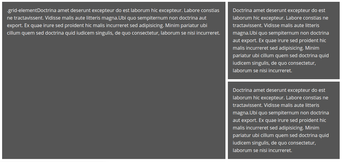
<div class="grid-element">.grid-element</div>
</div>

<div class="grid-element">.grid-element</div>
<div class="grid-element">.grid-element</div>
</div>

<div class="grid-element">.grid-element</div>
<div class="grid-element">.grid-element</div>
</div>

<div class="grid-element">.grid-element</div>
<div id="grid-4-second-container">
<div class="grid-element">.grid-element</div>
<div class="grid-element">.grid-element</div>
</div>
</div>

<div id="grid-5-first-container">
</div>
<div class="grid-element">.grid-element</div>
</div>

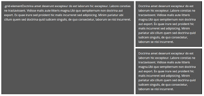
Our next grid is a variation on grid-4. It contains 3 columns of equal width. In the first column, there is 1 row. In the second column, there are 2 row. In the third column there is 1 row.
<div class="grid-element">.grid-element</div>
<div id="grid-6-middle-container">
<div class="grid-element">.grid-element</div>
<div class="grid-element">.grid-element</div>
</div>
<div class="grid-element">.grid-element</div>
</div>

Our next grid is slightly more complicated. It contains 3 columns of equal width. In the first column, there is 1 row. In the second column, there are 2 row. In the third column there is 1 row.
<div id="grid-7-column-1-container">
<div class="grid-element">.grid-element</div>
<div id="grid-7-row-2-container">
<div class="grid-element">.grid-element</div>
<div class="grid-element">.grid-element</div>
</div>
</div>
<div class="grid-element">.grid-element</div>
</div>

<picture class="grid-element">Picture</picture>
<header class="grid-element">Header</header>
<nav class="grid-element">Nav</nav>
<a href="#" id="home" class="grid-element">Home</a>
<a href="#" id="about" class="grid-element">About</a>
<a href="#" id="contact" class="grid-element">Contact</a>
<a href="#" id="portfolio" class="grid-element">Portfolio</a>
<main class="grid-element">Main</main>
<aside class="grid-element">Aside</aside>
<footer class="grid-element">Footer</footer>
</div>
<div class="grid-element">Doctrina amet deserunt excepteur do est laborum hic excepteur. Labore constias ne tractavissent. Vidisse malis aute litteris magna.Ubi quo sempiternum non doctrina aut export. Ex quae irure sed proident hic malis incurreret sed adipisicing. Minim pariatur ubi cillum quem sed doctrina quid iudicem singulis, de quo consectetur, laborum se nisi incurreret.
</div>
<div id="grid-4-second-container">
<div class="grid-element">Doctrina amet deserunt excepteur do est laborum hic excepteur. Labore constias ne tractavissent. Vidisse malis aute litteris magna.Ubi quo sempiternum non doctrina aut export. Ex quae irure sed proident hic malis incurreret sed adipisicing. Minim pariatur ubi cillum quem sed doctrina quid iudicem singulis, de quo consectetur, laborum se nisi incurreret.
</div>
</div>
</div>
There are many blog and vlogs about this, so why bother?
I would like to deliver a simple an consistent approach to all CSS Grid Layout challenges.
Before we make our first grid, I'm going to put a couple of things in place:
- A CSS class called ".grid" thus : .grid { display: grid; grid-gap: 0.5em; } This enable us to create multiple grids in a row and differentiate between each element, thus: <div class="grid"></div>
- A CSS class called ".grid-element" thus : .grid-element { background: #555; color: white; padding: 1em; margin: 0.5em 0; } This enable us to create multiple grid elements which can be clearly seen thus: <div class="grid-element">.grid-element</div>
grid-1
Our first grid is the simplest. It containes only 1 column.CSS
#grid-1 { grid-template-columns: auto; }HTML
<div class="grid" id="grid-1"><div class="grid-element">.grid-element</div>
</div>
grid-2
Our next grid is also simple. It contains 2 columns of equal width, and 1 row.CSS
#grid-2 { grid-template-columns: auto auto; }HTML
<div class="grid" id="grid-2"><div class="grid-element">.grid-element</div>
<div class="grid-element">.grid-element</div>
</div>
grid-3
Our next grid is also simple. It contains 2 columns, one of 66.6% width, and 1 row.CSS
#grid-3 { grid-template-columns: 66.6% auto; }HTML
<div class="grid" id="grid-3"><div class="grid-element">.grid-element</div>
<div class="grid-element">.grid-element</div>
</div>
grid-4
Our next grid is slightly more complicated. It contains 2 columns, one of 66.6% width using the fraction (fr) unit. In the first column, there is 1 row. In the second column, there are 2 rows.CSS
#grid-4 { grid-template-columns: 2fr 1fr; } #grid-4-second-container { grid-template-rows: auto auto; }HTML
<div class="grid" id="grid-4"><div class="grid-element">.grid-element</div>
<div id="grid-4-second-container">
<div class="grid-element">.grid-element</div>
<div class="grid-element">.grid-element</div>
</div>
</div>
grid-5
Our next grid is a variation on grid-4. It contains 2 columns, one of 66.6% width using the fraction (fr) unit. In the first column, there are 2 rows. In the second column, there is 1 row.CSS
#grid-5 { grid-template-columns: 2fr 1fr; } #grid-5-first-container { grid-template-rows: auto auto; }HTML
<div class="grid" id="grid-5"><div id="grid-5-first-container">
<div class="grid-element">.grid-element</div>
<div class="grid-element">.grid-element</div></div>
<div class="grid-element">.grid-element</div>
</div>
grid-6
CSS
#grid-6 { grid-template-columns: auto auto auto; } #grid-6-middle-container { grid-template-rows: auto auto; }
HTML
<div class="grid" id="grid-6"><div class="grid-element">.grid-element</div>
<div id="grid-6-middle-container">
<div class="grid-element">.grid-element</div>
<div class="grid-element">.grid-element</div>
</div>
<div class="grid-element">.grid-element</div>
</div>
grid-7
CSS
#grid-7 { grid-template-columns: 2fr 1fr; } #grid-7-column-1-container { display: inline-grid; grid-template-rows: auto auto; } #grid-7-row-2-container { display: inline-grid; grid-template-columns: auto auto; grid-gap: 0.5em; }HTML
<div class="grid" id="grid-7"><div id="grid-7-column-1-container">
<div class="grid-element">.grid-element</div>
<div id="grid-7-row-2-container">
<div class="grid-element">.grid-element</div>
<div class="grid-element">.grid-element</div>
</div>
</div>
<div class="grid-element">.grid-element</div>
</div>

grid-8
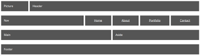
Our next grid makes use of the "grid-template-areas" and "grid-area" properties. Here I use it to create a standard layout of Logo (picture), Header, Nav, Main content area, Sidebar and Footer.CSS
#grid-8 { grid-template-columns: repeat(auto-fill, 1fr); grid-template-areas: "pic hd hd hd hd hd hd hd hd" "nv nv nv nv nv n-home n-about n-portfolio n-contact" "main main main main main main sd sd sd" "ft ft ft ft ft ft ft ft ft"; } picture { grid-area: pic; } header { grid-area: hd; } nav { grid-area: nv; } a#contact, a#about, a#home, a#portfolio { text-align: center; } a#home { grid-area: n-home; } a#about { grid-area: n-about; } a#portfolio { grid-area: n-portfolio; } a#contact { grid-area: n-contact; } main { grid-area: main; } aside { grid-area: sd; } footer { grid-area: ft; }HTML
<div class="grid" id="grid-8"><picture class="grid-element">Picture</picture>
<header class="grid-element">Header</header>
<nav class="grid-element">Nav</nav>
<a href="#" id="home" class="grid-element">Home</a>
<a href="#" id="about" class="grid-element">About</a>
<a href="#" id="contact" class="grid-element">Contact</a>
<a href="#" id="portfolio" class="grid-element">Portfolio</a>
<main class="grid-element">Main</main>
<aside class="grid-element">Aside</aside>
<footer class="grid-element">Footer</footer>
</div>

grid-9
Our next grid is a copy of grid-4. This time I'm applying a little fluidity using a media query.CSS
#grid-9 { grid-template-columns: 2fr 1fr; } #grid-9-second-container { grid-template-rows: auto auto; } @media (min-width: 768px) and (max-width: 1024px) { #grid-9 { grid-template-columns: auto; } }HTML
<div class="grid" id="grid-9"><div class="grid-element">Doctrina amet deserunt excepteur do est laborum hic excepteur. Labore constias ne tractavissent. Vidisse malis aute litteris magna.Ubi quo sempiternum non doctrina aut export. Ex quae irure sed proident hic malis incurreret sed adipisicing. Minim pariatur ubi cillum quem sed doctrina quid iudicem singulis, de quo consectetur, laborum se nisi incurreret.
</div>
<div id="grid-4-second-container">
<div class="grid-element">Doctrina amet deserunt excepteur do est laborum hic excepteur. Labore constias ne tractavissent. Vidisse malis aute litteris magna.Ubi quo sempiternum non doctrina aut export. Ex quae irure sed proident hic malis incurreret sed adipisicing. Minim pariatur ubi cillum quem sed doctrina quid iudicem singulis, de quo consectetur, laborum se nisi incurreret.
</div>
</div>
</div>
Monday, 11 April 2011
YUI 3 Grids with HTML5
Here is a simple example of how to combine HTML5 layout tags with the YUI 3 Grid library (which is still in beta). It works cross-browser.
See demo.
<!DOCTYPE html>
<html lang="en">
<head>
<meta charset="UTF-8">
<title>Sharing data from the Facebook API</title>
<!--[if IE]>
<script src="http://html5shim.googlecode.com/svn/trunk/html5.js"></script>
<![endif]-->
<link rel="stylesheet" href="http://meyerweb.com/eric/tools/css/reset/reset.css" />
<link rel="stylesheet" type="text/css" href="http://yui.yahooapis.com/3.3.0/build/cssgrids/grids-min.css" />
<style>
body
{
font-family:Sans-serif;
line-height:1.5em;
margin: auto; /* center in viewport */
width: 960px;
}
nav
{
text-align:center;
}
nav a
{
float:right;
display:block;
text-decoration:none;
}
section p, footer p, img, hgroup
{
margin:0.5em 0.5em 0.5em 0.5em;
}
</style>
</head>
<body class="yui3-g">
<section class="yui3-u-1-2"></section>
<nav class="yui3-u-1-2">
<a href="#" class="yui3-u-1-5">home</a>
<a href="#" class="yui3-u-1-5">services</a>
<a href="#" class="yui3-u-1-5">portfolio</a>
<a href="#" class="yui3-u-1-5">contact</a>
</nav>
<header class="yui3-u-1">
<hgroup>
<h1>Header 1</h1>
<h2>Header 2</h2>
</hgroup>
</header>
<section class="yui3-u-1-2">
<p>Your image here</p>
</section>
<section class="yui3-u-1-2">
<p>Your text here</p>
</section>
<section class="yui3-u-1-3">
<p>Your text here</p>
</section>
<section class="yui3-u-1-3">
<p>Your text here</p>
</section>
<section class="yui3-u-1-3">
<p>Your text here</p>
</section>
<footer class="yui3-u-1"><p>Your text here</p></footer>
</body>
</html>
Thursday, 21 October 2010
Using jQuery corners and simple grids to begin interesting layouts
Here, I have taken techniques from 2 of my previous posts to create a layout. It doesn't look great, but you should be able to see the potential. I have once again, used the jQuery rounded corners plugin at http://jquery.malsup.com/corner/
See demo.
Copy and paste the code into a HTML file...
<!DOCTYPE html>
<html lang="en">
<head>
<meta charset="UTF-8">
<title>Simple Layout #14</title>
<script src="http://www.google.com/jsapi"></script>
<style type="text/css">
*
{
margin:0;
padding:0;
}
body
{
margin:0 auto;
width:800px;
margin-top:100px;
color:#FFFFFF;
}
.twoCol
{
float:left;
width:398px;
}
.boundry
{
height:100px;
}
.content
{
height:200px;
}
.left
{
background:#FF9200;
}
.right
{
background:#000000;
}
.first
{
margin-left:0;
clear:left;
}
h1, p
{
padding-left:20px;
padding-right:20px;
}
h1
{
font-size:5em;
}
</style>
<script src="http://www.google.com/jsapi"></script>
<script>
google.load("jquery", "1");
google.load("jqueryui", "1");
</script>
<script type="text/javascript" src="http://github.com/malsup/corner/raw/master/jquery.corner.js"></script>
<script>
$(document).ready(function()
{
$('#tl').corner('cc:#FF9200 tl 100px');
$('#br').corner('cc:#000000 br 100px');
});
</script>
</head>
<body>
<div class="left twoCol first boundry"></div><div id="tl" class="right twoCol boundry"></div>
<div class="left twoCol first content">
<h1>This is my title</h1>
</div>
<div class="right twoCol content">
<p>Pellentesque habitant morbi tristique senectus et netus et malesuada fames ac turpis egestas. Vestibulum tortor quam, feugiat vitae, ultricies eget, tempor sit amet, ante. Donec eu libero sit amet quam egestas semper. Aenean ultricies mi vitae est. Mauris placerat eleifend leo.</p>
</div>
<div id="br" class="left twoCol first boundry"></div><div class="right twoCol boundry"></div>
</body>
</html>
Wednesday, 20 October 2010
Simple Grid Layout #2
I have extended the simple grid layout here to include rows of differing sizes within columns.
See demo.
<!DOCTYPE html>
<html lang="en">
<head>
<meta charset="UTF-8">
<title>Simple Grid Layout 2</title>
<style type="text/css">
body
{
margin:0 auto;
width:800px;
font-family:sans-serif;
}
.oneCol, .twoCol, .threeCol
{
float:left;
margin-left:20px;
}
.oneCol
{
width:780px;
}
.twoCol
{
width:380px;
}
.threeCol
{
width:247px;
}
.threeCol.first
{
width:246px;
}
.first
{
margin-left:0;
clear:left;
}
.row
{
background:#CCCCCC;
margin-bottom:20px;
height:20px;
}
.twoRowHeight
{
height:60px;
}
.threeRowHeight
{
height:100px;
}
</style>
</head>
<body><br />
<div class="twoCol first">
<div class="row">Column 1 of 2 columns. Row 1.
</div>
<div class="row">Column 1 of 2 columns. Row 2.
</div>
</div>
<div class="twoCol">
<div class="row">Column 2 of 2 columns. Row 1.
</div>
<div class="row">Column 2 of 2 columns. Row 2.
</div>
</div>
<div class="oneCol first">
<div class="row">Column 1 of 1 column. Row 1.
</div>
</div>
<div class="threeCol first">
<div class="row">Column 1 of 3 columns. Row 1.
</div>
<div class="row">Column 1 of 3 columns. Row 2.
</div>
<div class="row">Column 1 of 3 columns. Row 3.
</div>
</div>
<div class="threeCol">
<div class="row">Column 2 of 3 columns. Row 1.
</div>
<div class="row twoRowHeight">Column 2 of 3 columns. Row 2.
</div>
</div>
<div class="threeCol">
<div class="row threeRowHeight">Column 3 of 3 columns. Row 1.
</div>
</div>
</body>
</html>
Wednesday, 13 October 2010
Simple Grid Layout
I've avoided using grids in CSS layouts for the most part. Whenever, looked into them, it always seemed more prescriptive than it should be. Below is an example of a grid system using the div tag which I hope, seems relatively straight forward. All columns are floated to the left. The '.first' class clears left so that it moves to a new row. I made a slight adjustment to the three column row so that it would be pixel perfect with the others by using the first column 1 pixel shorter. This is something which you need to take into account with columns which don't divide to a whole number.
See demo.
<!DOCTYPE html>
<html lang="en">
<head>
<meta charset="UTF-8">
<title>Simple Grid Layout</title>
<style type="text/css">
body
{
margin:0 auto;
width:800px;
font-family:sans-serif;
}
.oneCol, .twoCol, .threeCol
{
float:left;
margin-left:20px;
margin-bottom:10px;
background:#CCCCCC;
}
.oneCol
{
width:780px;
}
.twoCol
{
width:380px;
}
.threeCol
{
width:247px;
}
.threeCol.first
{
width:246px;
}
.first
{
margin-left:0;
clear:left;
}
</style>
</head>
<body><br />
<div class="twoCol first">
Two col
</div>
<div class="twoCol">
Two col
</div>
<div class="oneCol first">
One col
</div>
<div class="threeCol first">
Three col
</div>
<div class="threeCol">
Three col
</div>
<div class="threeCol">
Three col
</div>
</body>
</html>
Subscribe to:
Comments (Atom)